Suzanne Tucker’s Line of Hearths Exudes Old World, European Charm
San Francisco Cottages Gardens / February 2016
By Linda O’Keeffe
Photography by Annie Schlechter
 Suzanne Tucker’s wanderlust plays an inspirational role in the interiors, tableware, textiles and furniture she designs. The inlaid marble floors of a Venetian basilica led to the ornate patterns in her dinnerware for Royal Limoges; Granada’s Alhambra Palace influenced her first line of outdoor textiles for Michael Taylor Designs—the second debuts in late February—and an English chair provided the DNA of the extensive outdoor furniture collection she is currently completing.
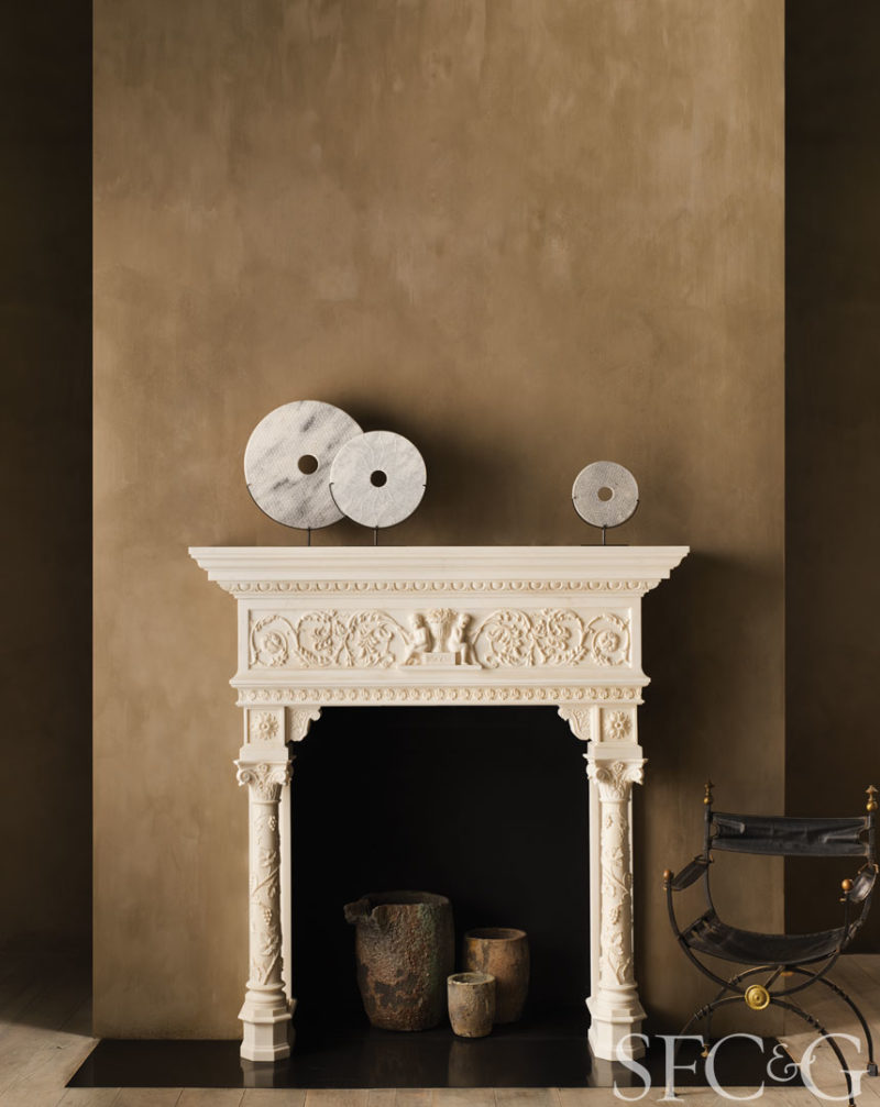
When Chesney’s, Britain’s largest fireplace manufacturer, commissioned her to create a line of hearths, Tucker let the romantic, visual history of France and Italy fuel her imagination. “My relationship with Chesney’s dates back more than 15 years,” says Tucker, “and two of my dear colleagues, Bunny Williams and Alexa Hampton, have already contributed to their catalog.” She devised four mantel styles that exude Old World, European charm, each one customizable and available in stone or marble. Bellagio has crest-like carvings and vine-wrapped pillars; Provence’s angularity recalls a tailored Regency-style; Randolph is curvaceous and robust; and Voltaire’s scrolls and canted legs feel slightly art nouveau.
“Embellishments on a fireplace surround aren’t merely superficial decoration. They’re meant to animate once they mingle with firelight,” says Tucker, who’s interior design process begins instinctively, the moment she sizes up a project’s bones. “A room’s scale, balance, proportion and flow affect our mood and our sense of well being in subtle, subliminal ways.” A mantel is applied architecture, and functions as a focal point and a structural anchor, so Tucker spent time resolving the visual weight of her collection. She finessed each mantel’s silhouette so it would protrude beyond a wall by just the right amount, and look handsome from all perspectives.
Magazine editors long ago pegged Tucker’s clean-lined, signature style as “the mix”—a term she feels is way overused—and she is highly unlikely to install any piece from this new collection in a space that’s either relentlessly modern or that stays faithful to any one period of antiques. “The furnishings in my projects always have a wide provenance because that’s how I achieve a classic look; a look that won’t date,” she says. “The interiors world is fashionable but there’s nothing ‘here today, gone tomorrow’ about it. A room isn’t like a dress you discard because it’s no longer trendy. Timelessness, in all things, may be the one and only rule I follow.”
A version of this article appeared in the February/March 2016 issue of SFC&G (San Francisco Cottages & Gardens) with the headline: Taking up the Mantel.
Posted on Wednesday, April 27th, 2016 at 5:03 pm. Filed under: Commentator RSS 2.0 feed.

Suzanne Tucker’s Line of Hearths Exudes Old World, European Charm
San Francisco Cottages Gardens / February 2016
By Linda O’Keeffe
Photography by Annie Schlechter
When Chesney’s, Britain’s largest fireplace manufacturer, commissioned her to create a line of hearths, Tucker let the romantic, visual history of France and Italy fuel her imagination. “My relationship with Chesney’s dates back more than 15 years,” says Tucker, “and two of my dear colleagues, Bunny Williams and Alexa Hampton, have already contributed to their catalog.” She devised four mantel styles that exude Old World, European charm, each one customizable and available in stone or marble. Bellagio has crest-like carvings and vine-wrapped pillars; Provence’s angularity recalls a tailored Regency-style; Randolph is curvaceous and robust; and Voltaire’s scrolls and canted legs feel slightly art nouveau.
“Embellishments on a fireplace surround aren’t merely superficial decoration. They’re meant to animate once they mingle with firelight,” says Tucker, who’s interior design process begins instinctively, the moment she sizes up a project’s bones. “A room’s scale, balance, proportion and flow affect our mood and our sense of well being in subtle, subliminal ways.” A mantel is applied architecture, and functions as a focal point and a structural anchor, so Tucker spent time resolving the visual weight of her collection. She finessed each mantel’s silhouette so it would protrude beyond a wall by just the right amount, and look handsome from all perspectives.
Magazine editors long ago pegged Tucker’s clean-lined, signature style as “the mix”—a term she feels is way overused—and she is highly unlikely to install any piece from this new collection in a space that’s either relentlessly modern or that stays faithful to any one period of antiques. “The furnishings in my projects always have a wide provenance because that’s how I achieve a classic look; a look that won’t date,” she says. “The interiors world is fashionable but there’s nothing ‘here today, gone tomorrow’ about it. A room isn’t like a dress you discard because it’s no longer trendy. Timelessness, in all things, may be the one and only rule I follow.”
A version of this article appeared in the February/March 2016 issue of SFC&G (San Francisco Cottages & Gardens) with the headline: Taking up the Mantel.
Posted on Wednesday, April 27th, 2016 at 5:03 pm. Filed under: Commentator RSS 2.0 feed.
Widescreen WordPress Theme by Graph Paper Press All content © 2026 by Linda O'Keeffe